What is this
Every Thursday, I will share a dev diary about what we’ve been working on over the past few weeks. I’ll focus on the interesting challenges and solutions that I encountered. I won’t be able to cover everything, but I’ll share what caught my interest.
Why am I doing it
I want to bring our community along on this journey, and I simply love writing about things I’m passionate about! This is my unfiltered dev journal, so please keep in mind that what I write here are my thoughts and will be outdated by the time you read this, as so many things change quickly. Any plans I mention aren’t set in stone and everything is subject to change. Also, if you don’t like spoilers, then don’t read this.

Space Engineers 2
- We released a much requested set of blocks this week 😉
- The team is working on VS 1.2, VS 1.5 and VS 2, but I was focusing on other projects this week so I don’t have that many SE2 updates
- We tweaked the ‘acceleration-based camera shake’ feature, which creates camera movement proportional to acceleration. Higher acceleration produces more shake.
The feature is disabled for standard walking/running movements to prevent annoyance, but activates during higher-acceleration scenarios like boost jetpack mode or when piloting ships with powerful thrusters.
Our next step is balancing the effect to provide meaningful feedback without becoming overwhelming. We’re also carefully considering implementing similar effects for deceleration that enhance immersion without being excessive.
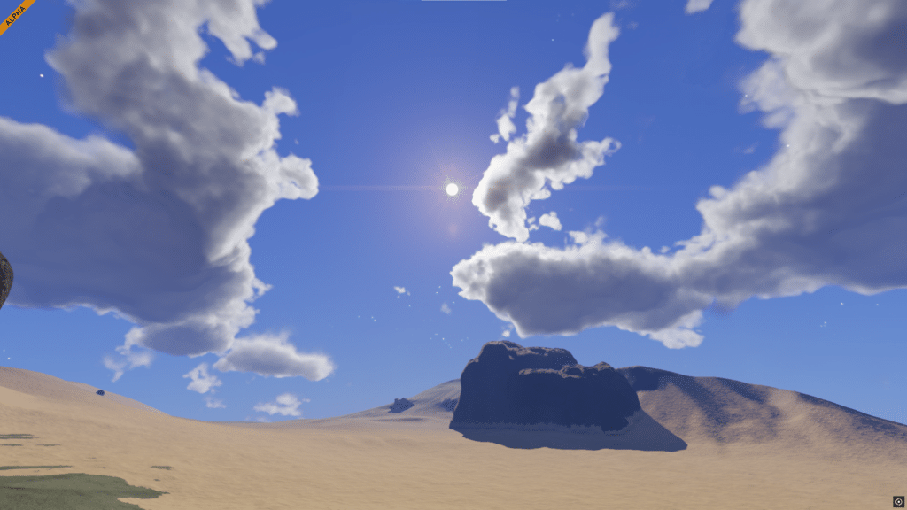
- VRAGE Render team is doing few experiments with clouds
- GUI and HUD prettification – we had a meeting with UI artist Alek, our game designers and programmers, to discuss specific changes to our GUI and HUD to make it consistent across the entire game, fix some UX issues and inconsistencies, and make it aesthetically pleasing. We ended up with a big list, so I’ll mention only some:
- Many screens don’t have proper layout with good proportions or things like golden ratio
- Back button is often over a horizontal line which makes you worry where it belongs (it breaks the Gestalt principle), the same for Load button in the Load game screen
- There are too many font sizes so we will narrow it down to max 3-5 sizes and use only those across the entire game
- There are too many colors (black, gradient of black, blue, blue with some green, etc.) so we will also narrow them down and make them consistent across the entire game
- Text size in HUD (especially the tooltips) is probably too small for console players (they would probably not pass certification) so we need to improve that too
- The biggest work will be to polish the screen layout of many screens (G-screen, Terminal, Game options, etc.) to be intuitive, things that belong together to be framed together, proper frame and background
- Also we allow players to change the GUI background opacity which may make some screens unreadable on bright scenes, so we will be addressing this too.
- I know that many players probably don’t worry about this stuff but we want to be proud of our work, and we simply can’t leave it like this!
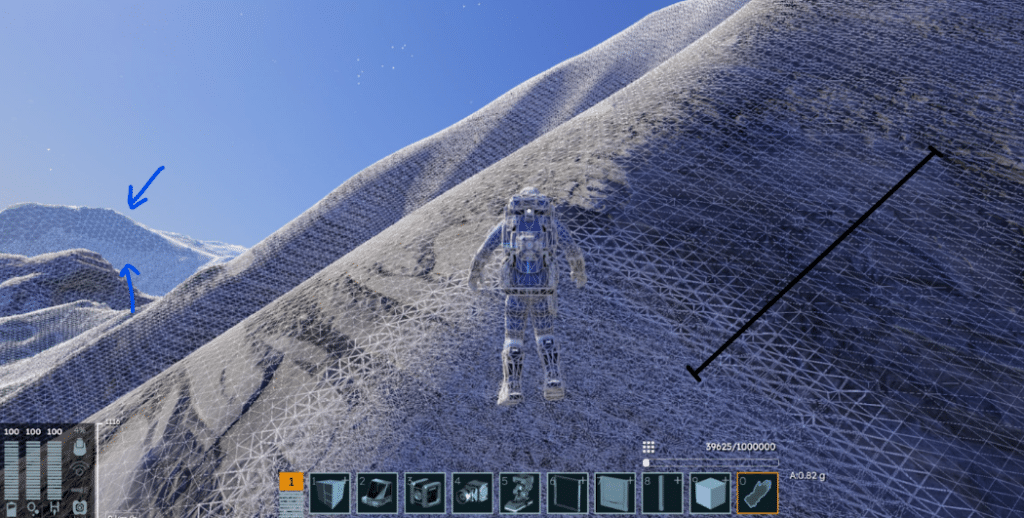
- Natiq and Mirko (our artists) are working on planetary textures and biomes. This is a big task, we still have many things we need to improve to make our SE2 planets look amazing. One thing that they proposed and we are considering is the terrain displacement in the far distances. I am not sure yet which way we will go (we can do it only visually, we can do it in terrain data – in voxels) but I think it’s very important for visual pleasure!



KEEN PLS USE COLORS IN ICONS AND MENU. WE HUMANS CAN SEE WAVELENGHTS 380 to 700 NANOMETERS, DO NOT LIMIT US TO JUST SHADES OF GRAY!
It’s just the style. Even though you are talking about icons, consider text. Wouldn’t it be distracting to have books written in rainbow font?
STRONGLY AGREE. The color mod on SE1 is a pain it conflicts with some mods, we have to install it everywhere etc.. WE WANT THIS PLEASE
I think the best approach would be to first make them grayscale and easy to differentiate like that, (for color blind people and/or situations where color doesn’t help) and then color them in.
I think a better course of action would be to have a toggle for greyscale or colour, I hate the idea of having distracting colours on the toolbar (apologies for the British spelling of “colour”)
Yeah, we will do this, it’s in the plan already. Thanks
Keep up the good work !
Killing it out there boys 😎
Clouds and camera shake – pretty cool additions
It would be cool, if clouds would cast shadows and would more realistically react to weather than in SE1. A great example for this can be seen in Sons of the Forest.
Regarding the text size in the HUD: while I realize that eventual console support is a goal, please do not oversimplify or “dumb down” things for PC players — the group that has currently purchased SE2 and is going through the Early Access period with you NOW. Too many PC games get hobbled because of the need to accommodate console limitations.
It’d be nice if you design the HUD as if its elements were projected on the inside of the helmet’s visor. Maybe add some curvature to it? Maybe some elements not present when visor open?
I would fancy that! Please do that, Keen. Would also further help to differentiate both games and make it feel more grounded in the game world.
This would be really nice. Along with the survival aspect coming soon it would make the immersion insane.
Other software companies could learn from keen’s dedication to quality. Thank you it is appreciated!
Keep up the good work!
“…the terrain displacement in the far distances. I am not sure yet which way we will go”Hopefully not in the same way that SE1 did it, my biggest issue in SE1 was the way that any spots on a planet that were mined would “pop” from a distance, making it very easy to find where players were, because deformation at a range was extremely obvious.Though maybe I misunderstand what you mean!The rest is looking great, those pipes look gorgeous!- Sev
Ik, you could scrape your ship against the ground at like 25ms and suddenly there is a massive crater if you looked back upon it from orbit. :/
Agree, it was a big problem for new players on server with PvP, hard to hide on planet start
This. Even if you dig underground and make tunnels.. standing on the surface you wouldn’t see it but when you fly higher and higher you can see your tunnel form. Found this out the hard way lol. Dug over a km with the “damaged hydrogen miner” and you can literally see it from 0.00p-g. Someone gonna find me eventually haha. I really hope it gets fixed in se2 so in voxel bases can be there truly. That and the blocks pop up before voxels so people will leave game above ground and come back and see every bit of your base. That needs a good fix too
Will there be any option to control turrets from third person with the mouse? I am aware it wouldn’t be much use in ships but it would be helpful for people who build Armoured Fighting Vehicles like me, because you are usually close to a target, or maybe for Naval Ships, as targets would move much slower on water than in space. Idk, just a weird shower thought