

What is this
Every Thursday, I will share a dev diary about what we’ve been working on over the past few weeks. I’ll focus on the interesting challenges and solutions that I encountered. I won’t be able to cover everything, but I’ll share what caught my interest.
Why am I doing it
I want to bring our community along on this journey, and I simply love writing about things I’m passionate about! This is my unfiltered dev journal, so please keep in mind that what I write here are my thoughts and will be outdated by the time you read this, as so many things change quickly. Any plans I mention aren’t set in stone and everything is subject to change. Also, if you don’t like spoilers, then don’t read this.

Space Engineers 2
VS2 – Planets & Survival Foundations
One of the small but important things we’re working on is improving how the game communicates with you. For example, we’re adding an onscreen indication of what you mined or grinded – and the exact amounts.

It’s a simple change, but it makes a big difference. The idea is the same as with the Unlock screens I showed in the last dev diary – moments that announce your progression and milestones. These kinds of cues help make the world feel more responsive.

We’re continuing to apply this lesson across the board – better communication from game systems towards the player. The goal is to make sure the game always lets you know what’s happening, without you having to guess or check logs and inventory screens.

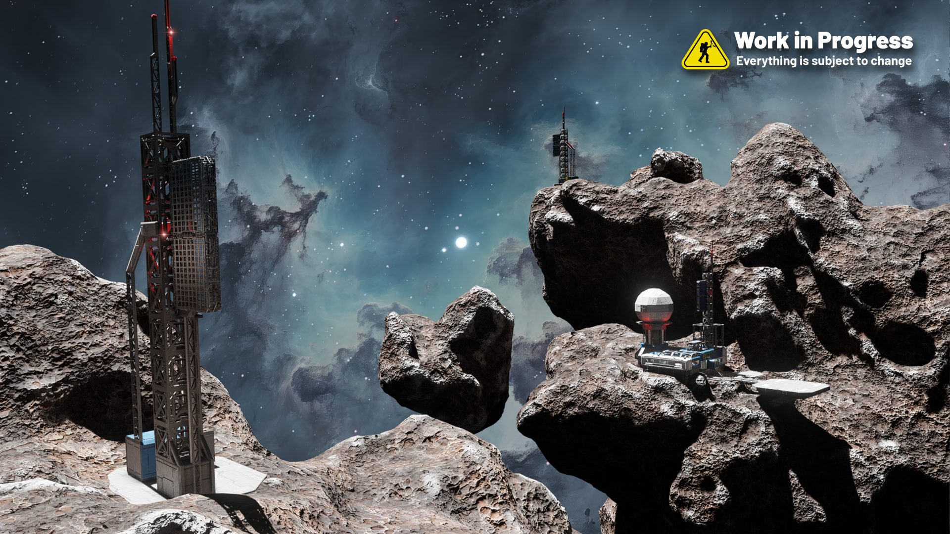
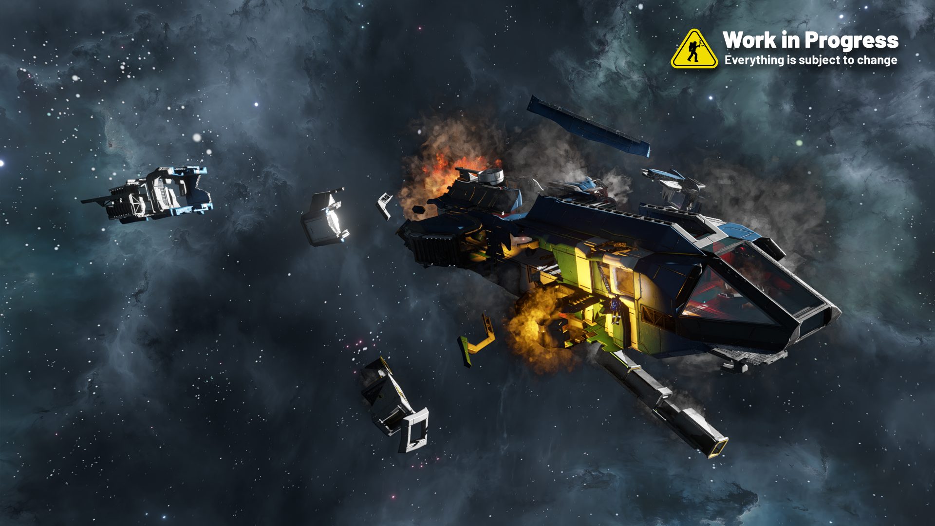
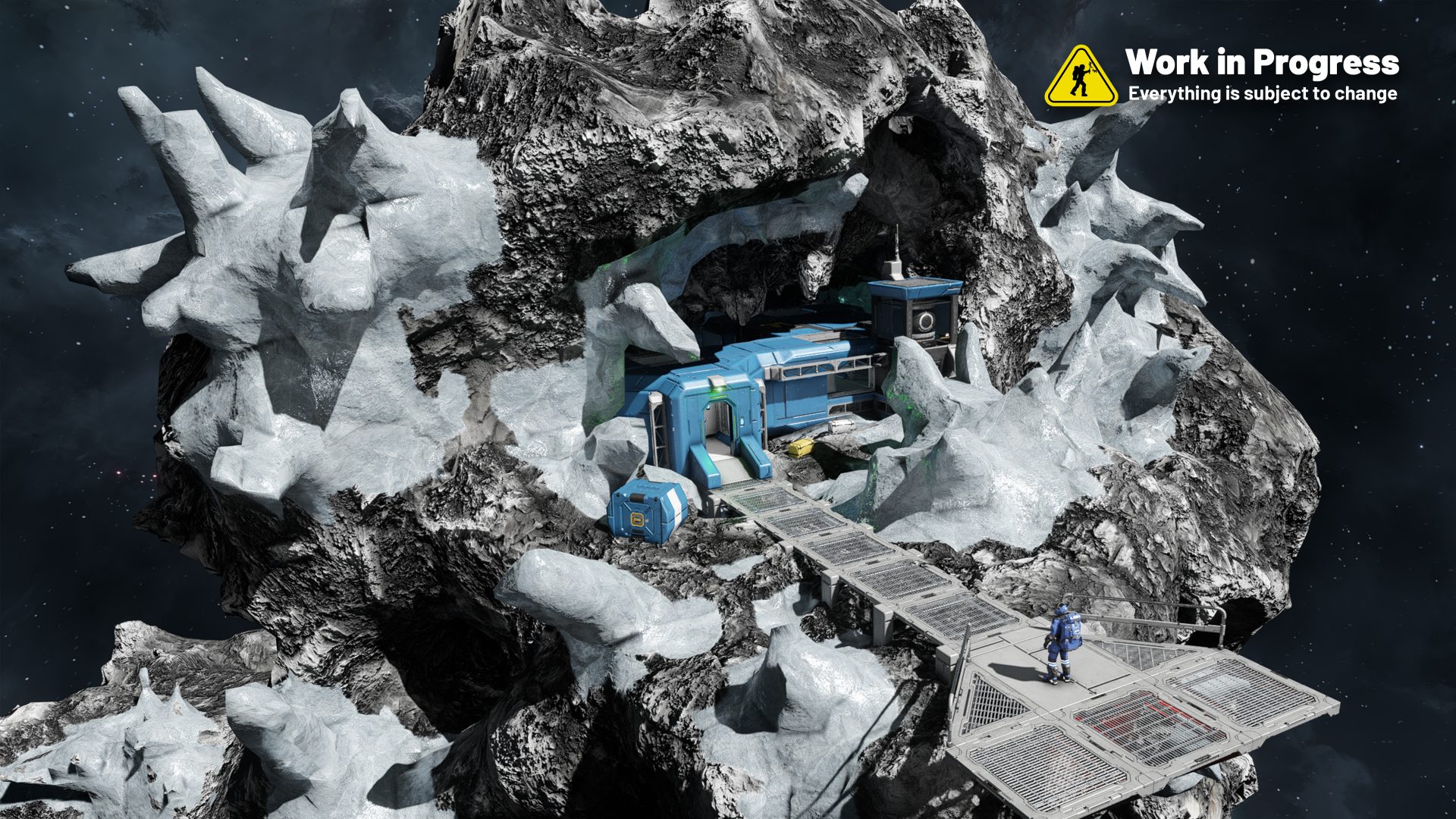
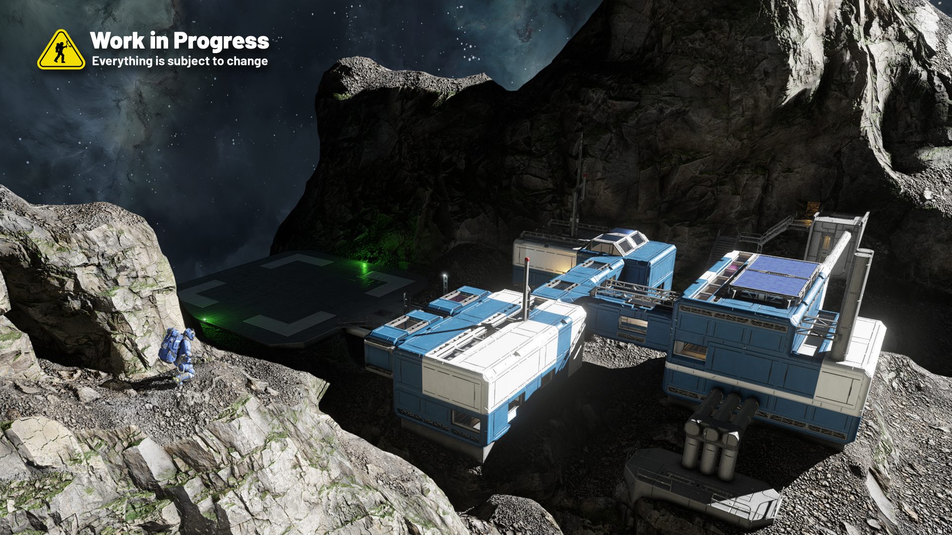
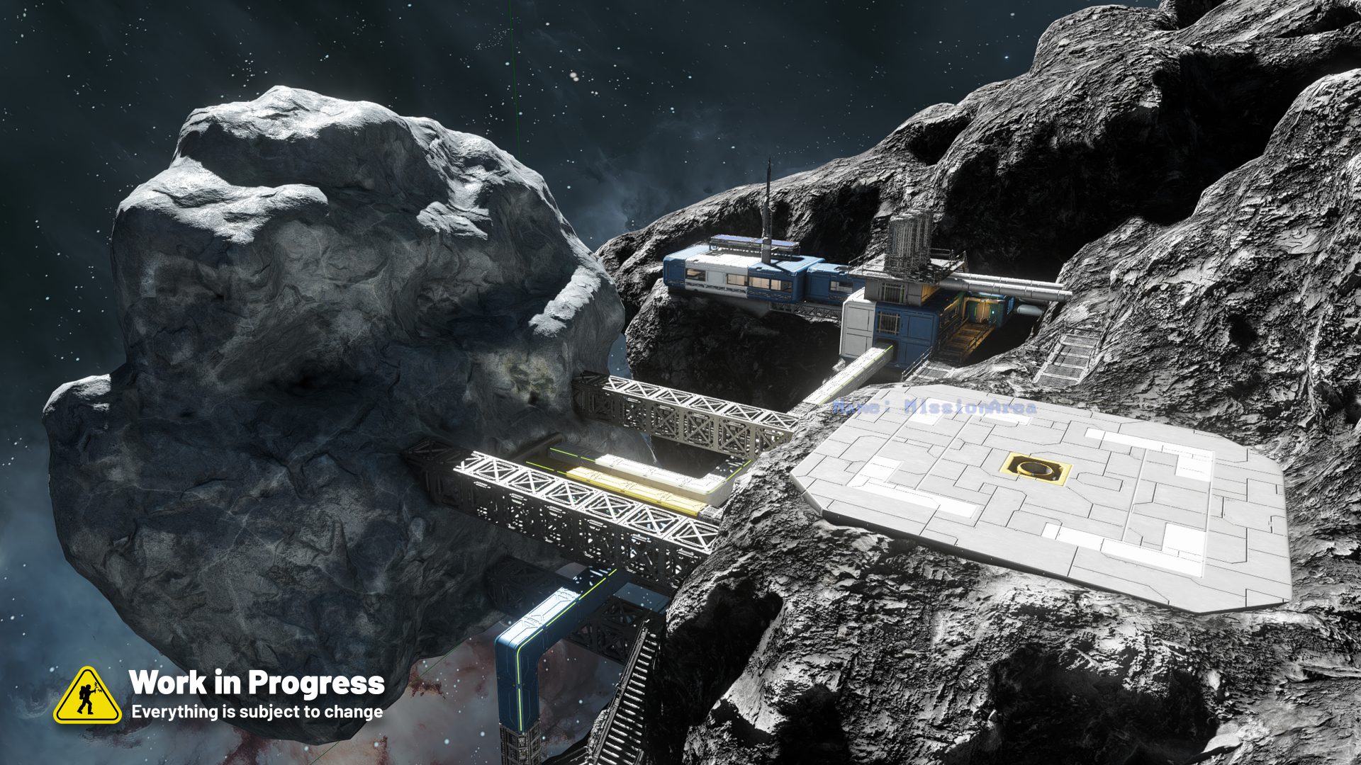
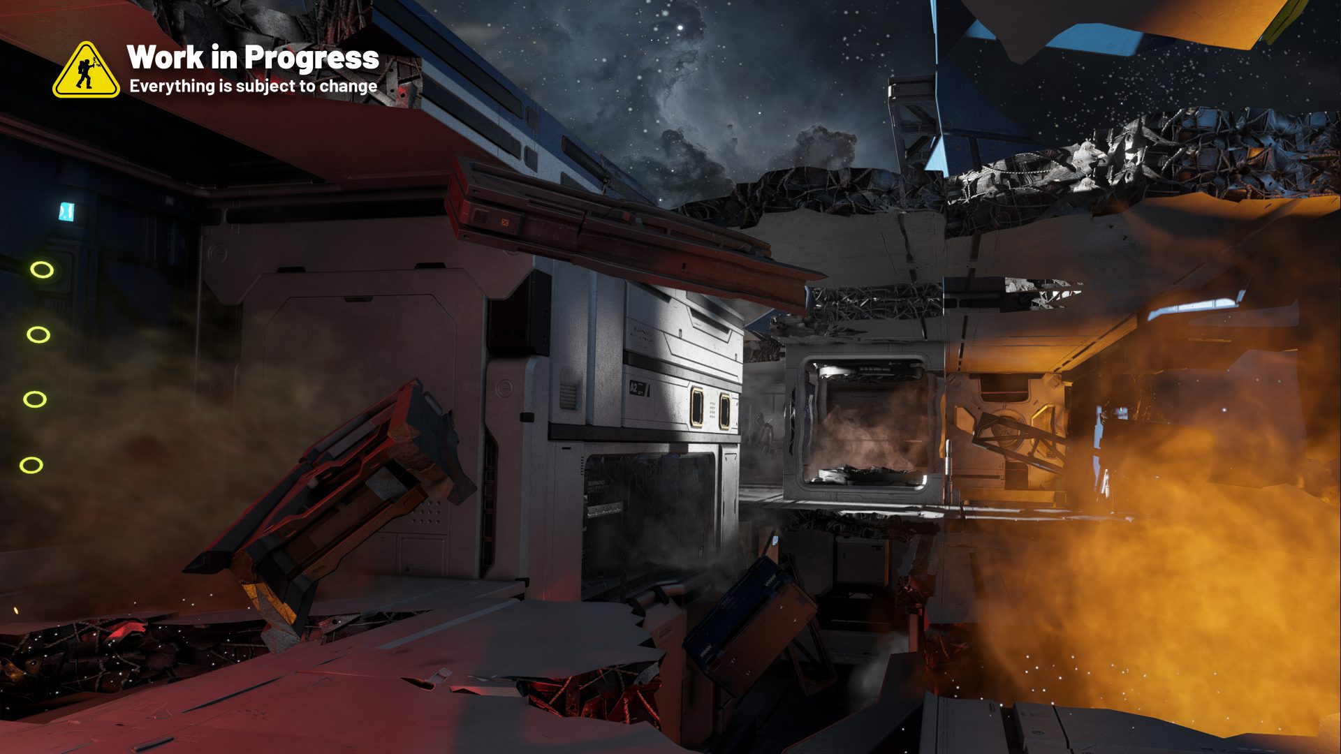
VS2 will also introduce the base systems for random encounters. At first, these will be non-dynamic and non-AI – simple handcrafted damaged ships, smaller stations and points of interest to bring more life to the world.
This is just the base of the whole future encounter system. You can expect broader themes, combat scenarios, and truly dynamic NPC encounters in updates down the road. Step by step, we’re moving toward a universe that feels less static and more reactive – where every playthrough can surprise you.
You can see some of our first experiments with random encounter systems here. These screenshots show our encounter templates – handcrafted prefabs that the game will later insert into the world, on planets, or among asteroids.
So if you notice a patch of grass floating in space – don’t worry, it’s part of the template testing process, not a new type of cosmic meadow.
Lately, I’ve been finishing the voice-over work for the VS2 Survival intro cutscene and the FTUE (First Time User Experience). Both feature a dialogue between Miro (the player) and Ivan, and sometimes Miro as the narrator. I really enjoy this process – giving personality and emotional tone to the story that frames the gameplay.
For VS2, the voice lines introduce players to the world of Almagest and set up the relationship between the two brothers. In future vertical slices, we’ll expand this further as new mechanics are added – wheels, water, NPCs, and more – adapting the narrative as the universe grows.
Examples from intro cutscene (before the Survival starts) – !!! SPOILER ALERT !!!


Example from Survival / FTUE:

Speaking of cutscenes – our Art Lead Natiq is running motion capture experiments for our character animations and cutscenes. These are early tests, but they already make a huge difference in our workflow and how fast we can create all the needed animations.
Here you can see examples of entering and exiting the Cryo Pod – captured with full body motion to make every movement smoother, more natural.
After VS2
Me and the teams are already planning our releases after VS2. We will share an updated roadmap together with the VS2 release.


VS3 – Water
We’re testing proper water propellers inside the game – and they work now! Still without any fine-tuning, but it’s exciting to see ships actually moving through water for the first time without any “cheated” thrusters.


Question to you: Where’s your sweet spot before in-game notifications stop helping and start feeling like noise?
Share your thoughts in the comments below – I read them all, and they’re one of my favorite parts of making our games.
Subscribe and get an email whenever I publish a new post!


Is there a way for people or fans to audition to be a voice for your game? I know I would love to, and i’m sure others would too
I’d love to know about this too!
Here, here! I’d love to have the opportunity to audition for voicing some aspect of Space Engineers 2!
Picatiny rail on the rocket magazine? Odd…odd choice.
The water thrusters should only work if they’re actually in the water. Water exposure level should drop their thrust to 0 like atmospheric thrusters do in thinning atmosphere in SE1, but obviously more aggresively.
maybe just drop low, because theoretically it should also work in atmosphere, no?
Wouldn’t it be better to also display the information about what you’re currently collecting on the right side? I find it a bit distracting in the middle of the screen.
Yeah concept is good it just needs to be smaller and in a corner or to the side
I totally agree. For me I would prefer the left side, but anything other than the screen center would be good.
Vejo referências a Empyrion aqui. Gostaria também que essa informação temporária aparecesse rolando na lateral esquerda.
Mas, por favor, não cometa o erro de colocar em tamanho muito pequeno. A comunidade aqui é composta principalmente por pessoas com mais de 40 anos.
O modo PvE certamente poderia incorporar diversas referências daquele jogo antigo, porém ainda vivo.
Exactly what I was thinking. I LOVE the notifications, but the center of the screen is kind of in the way. I think on the side or in a corner would be better. But I’d have to play it to know for sure.
In-game notifications are tricky for me. I like having info, but sometimes they make it feel *too much* like a game, you know? Some notification systems that stand out from other games I’ve played a lot:
• Stellaris allows you to control the prominence of each specific type of notification. Don’t want drilling notifications but want everything else? Turn off the drilling notification. Don’t want grinding notifications to be so prominent? Demote them to a simple icon, no banner. That sort of customization is really cool.
• Hardspace: Shipbreaker does all of its notifications through an in-game HUD that is portrayed as a part of the player’s helmet. As such, environmental threats can damage or distort the HUD, along with any notifications it might be displaying. Having the entire notification system feel like it exists *in* the world like this really helps to eliminate the feeling of being taken out of it by receiving many notifications.
• One of the greatest gaames of all time, Homeworld did virtually all of their notifications through radio chatter, no on-screen elements at all, and it became a beloved aspect of the game. There are plenty of reason why that kind of system wouldn’t work well for SE2, but I think it does speak to the value of setting your notification system in the world rather than it being an omniscient layer on top.
I believe on-screen information shouldn’t be redundant. If I’m dismantling components, I want to see the classic menu for the item being dismantled, not the material that ends up in my inventory after being dismantled (that’s trivial). At most, I want a statistic about how full my inventory is when it reaches critical levels. When continuously gathering materials (mining ore), the system should display something minimally invasive to prevent prolonged exposure from becoming annoying. The point is to enrich without being cumbersome; I want to be able to forget about that information if it’s not relevant to me at that moment.
I generally welcome the idea of providing the player with information without requiring them to navigate to the menu. However, if I could make a wish, it would feel more immersive to be able to see a cargo status in the cockpit, or even on the suit display. I know other games do this with pop-up messages, but I hope it at least doesn’t obstruct the view.
UI for me, must be less than 20% out of overall screen space and don’t obstruct screen center.
i’m excited for established characters but i was really hoping gor character customization and ideally even choosing between a couple voices for our character, at least in multiplayer
Marek has said in the passed when you are playing multiplayer you are playing your character that you can customise anyway you like freely will not effect the story or compaign in single player you following the campaign and playing this character
personally I like to use in game screens to show this kind of informtion. Its okey if the notifications are small and perhaps not even text but rather contectual like sounds etc. But for me, I don’t like the arcade kind of way of displaying information. If I can have these notifications in displays and integrated into the build, that would be awesome.
Will we be able to steer our ships based on the shape, so that steering a long ship sideways will steer you and slow you down by the sheer pressure of water on the hull? And in turn creating boxy ships would not be very optimal.
Although I realise the same could then be applied for air dynamics which currently only mods do for SE1 (which would be nice to be toggleable per-world btw), but in water it makes even more sense to be on by default since the water itself will slow you down the moment you hit it, so the shape of the hull should play a role as well.
I doubt it, I’m afraid it would have a big impact on performance(((
don’t forget that Space Engineers 2 are still a sandbox, not a simulator like Stormworks or the Kerbal Space Program (although, to be honest, I’d also like to see water physics and aerodynamics in perfect condition for release!)
Please, don’t put info one might not want in the middle of the screen.
Put it on the side and give an option to disable it. A lot of people value the visibility and the immersion, this is not it.
I beg you to be careful with visual clutter. While its nice to know what you are mining there is no need to babysit all players through these things. Please make them optional and/or alot less persistantly on screen. I feel like a big part of SE is also it immersion and slapping ui elements everywhere breaks that. I’d like to have these kind of things for example as a cockpit lcd app that i can select. Maybe you could even have “lcd apps” for the players helmet hud. This way you’d have the configurability and expandability which a sandbox like SE needs.
Hard agree on the suit integrated “LCD apps” (to carry forward terminology from SE1) beginner players can hang onto certain default readouts, while more advanced players get powerful and immersive suit functions for navigation, etc. while having full control over clutter. Consider also how player information might be helped by the introduction of a scanner tool to make learning about the world and systems more deliberate. Games like subnautica and metroid prime do this very well, where information accumulates as the character uses in-game tools rather than an omniscient video game layer on top of everything.
Love the work on the interface feedback, will really help avoid playing with menues. Howver, it would be great if the central area of the screen was clear of any hud elements/clutter. Could these be possibly shifted to one of the corners or alternatively opacity options?
toggle for low information hud readout, medium, dynamic, high/full
although modding can probably take care of all that stuff
Я думаю, нам нужно сделать уведомление о майнинге где-то на краю монитора.
I am actually a fan of the way Starfield handles ore mining; where it tells you what you’re looking at only when you have activated your scanner/mining laser. That way, you’re only seeing those HUD elements when it’s pertinent to what you’re doing.
with the move of making the campaign to be for every player in the multiplayer, i would had ditched the idea of the main character having name, being refered by the last name at most so players can play with either male or female characters. i dont want SE2 multiplayer to be a clones festival full of the same looking dude, far less now that we only have transparents visors.
Didn’t they say that in MP only one player would be the main character and the rest side characters? So there shouldn’t be any clones.
I like the idea of having a station where the main character is one option, and you can have other options next to him. I understand that the game’s story is about this man, and some games are like that, but I also like having choice, especially in multiplayer
If I were to give you any advice on the notifications, what I would do would be something like star citizen we have a bar that kind of pops up in the middle that expands into kind of the notification in the very very top of the screen just under the compass
https://robertsspaceindustries.com/spectrum/community/SC/forum/3/thread/notification-ui
I dont think Star Citizen is an ideal role model for any game developer.
This temporary information could appear scrolling on the left side. It’s in the dated, but still alive, game Empyrion.
But please don’t make the mistake of making it too small. Most of the community here is over 40 years old.
The PvE mode could certainly include several references to this game.
I would personally prefer a toggle option. While it is helpful to see the ore received, screen clutter goes from helpful to annoying super quick.
ROFL, the flipping of the craft to get back to the water, that’s hilarious
would be an interesting a random encounter with a biodome in space. With grass, trees, and black jack on the side.
In space.
What makes people use propelers instead of thrusters on water, is there some significant benefit? Or will atmos/hydro be limited in ways?
daily reminder this game would be the tits with drag
I don’t really like the notification in the middle of the screen. If it’s not too much to ask, make it selectable to be moved to the sides.
will atmo thrusters also provide a little force underwater since they have a propeller? i could imagine that would help if you accidentally drop an atmo ship underwater
theyre not propellers, its a turbine for presumably a jet engine. jet engines arent designed to operate underwater at all. turbines / compressors are used specifically to harness incoming air for power production and compressing air to use as oxidizer for jet fuel. in real life when water touches a jet engine that engine is done producing any thrust
The motion capture clips look amazing! Is there any sort of way to use mo capped animations putside of cutscenes? I think it would add much more life and fluidity to gameplay. For example, maybe weapon reloading animations or pushing buttons or what not could have a mocapped animation. It might be difficult to achieve that in a lot of places, but i think one spot where it would stand out is in cockpit first person. one of my favorite things in se2 right now is the random button pressing animation that will occasionally occur when sitting in a cockpit in first person. if that sort of animation could correlate to buttons pressed or even steering the ship that would be next level. I also think it would align with the idea of feedback from systems that you are focusing on in this post!
It seems I’m out voted given a lot of these comments, but while I do like the idea of the story, I’m a bit iffy on the idea of giving the player character a name, let alone a voice, this is ultimately a sandbox game, and giving the player character to much of a presence outside of the player’s own actions feels like it could steal a lot of the players agency. I’m not trying to say the player voice should be scrapped, but I would urge you to consider the consequences of giving the player characters relationships too much prominence
Evan,
Since the story is an optional thing that can be toggled off I feel that they should go big with it. People who want purely sandbox can turn off the story and just play as if in SE1. However, I think a story would add a lot of direction to the game for those feeling that SE1 was too empty or meaningless. Further, I think that if done right we could have an almost subnautica like story mode that would be fantastic and compelling. Totally hear what you are saying though about keeping things more open when it comes to the main character, if it weren’t for the fact that the story is not forced I would 100% be on board with you.
Zer0 is gonna be very happy.
I’d love to see some videos of the large underwater propellers. For immersivity it’s important to me that they spin up slowly and also have linearily increasing accelleration.
I think during the first hour or two the game could be fairly verbose. Then start cutting down a bit such that it only tells me about the content of a new thing I mined or ground down. Eventually don’t tell me much of anything about mining or grinding.
I do think some highly valuable or premium things could notify me or if it is something critical to my current mission.
It might not be feasible (or that useful) but during early objectives there could be some kind of indication of having mined enough for the mission. Versus not knowing how much stone or iron is needed for the next step. I always just fill my suit but…
The sweet spot for me on notification depends on what information. As a new player I like the notifications and tips upon initial discovery or experience. For example, if as a new player my oxygen level gets to a certain low point I might like a notification/tip that explains what happens if I run out of oxygen, and how I can restore my oxygen. But having that in the face notification everytime I get low on oxygen after that, would be too much.
For things like the materials being mined, and backpack/storage capacity I think that should be part of the HUD like a screen on your ship or something. In SE1 I used that mod (cant think of the name) that indicated how full my ship inventory was since in vanilla you had to keep checking your actual storage containers…
it’s cool to start with to get used to the game and get little tips but once you pretty much learn the game I should be able to just turn it off, also I hope you add a booster thruster to the game like you have on the backpacks but for ships but it’s got like a charge time or something or it has to be refueled with a special fuel or something
add in opacity, size, position options for those notifications. and maybe a way to fine tune what notifications you get or outright disable them all, and we’re set 👍
If I’m mining something I already know what it is because I’m looking right at the ore patch and I assume the drill’s scanner is telling me what it is and my inventory bar shows how full I am. The notification would be more helpful for seeing components you get when grinding but it being in the center is distracting. A toggle for it for both ores and grinding would be best.
“Where’s your sweet spot before in-game notifications stop helping and start feeling like noise?”
– I like my notification only in very important cases, like low energy, oxygen, hydrogen or health. Constant “inventory full” notification driving me crazy. Full inventory isn’t threat for my avatar or my ship.
The notifications aren’t in a bad spot, but I would definitely appreciate if they were a bit less ‘in your face’, whether by moving them to the side, making them smaller, or making them a bit more transparent.
Otherwise, important notifications are fine to be big and flashy, somewhere like the top of your screen for example. A bright notification that says “HEALTH CRITICAL” or “OXYGEN LOW” makes sense, but definitely NOT “INVENTORY FULL”.
“Where’s your sweet spot before in-game notifications stop helping and start feeling like noise?”
-For me, it it’s the rudamentary tutorials as well as the persistent player notifications of the player’s inventory being full. For example: I don’t really need to know “WASD” controls my base movement, those controls have become a standard in gaming for several years now. The: “Inventory Full” message for player inventory especially on rapid repeat can be annoying: If I attempt to pick up a chunk with my player, I don’t need to be told 3-6 times my inventory is full after making one attempt. Though, I wouldn’t mind having a warning if my ship’s inventory is full, or if I’m going to be too heavy to safely enter/attempt exiting an atmosphere.
for in game notifications, stellaris has a stellar(pun intended) notification system, it by default asks if you want to have the tutorial(and all tutorial related messages) and gives tou all notifications, but you can individually(this is the important part) decide what notifications you want to see, it would also be good if at the end of the tutorial, or somewhere along the way it shows you where this setting is, as some games have good tutorials but forget to show all the settings
Regarding the onscreen indication of what you mined or grinded – and the exact amounts. Why is the necessary to add?
SE1 already did a good job of notifying you what you’re picking up and how much. When picking up items off the ground, like when hand drilling, you can clearly see how much of that item you are about to pick up, as it’s part of the item’s name when you are looking at it. When using a drilling ship, I don’t think it’s necessary at all to show how much ore we’re getting, just to know when our cargo is full, same goes for a grinder ship. (I don’t think I’ll ever need to know/care that I’ve mined 100000kg of Iron ore). As for using it to tell us what ore we’re currently mining. Again, I’m not sure that’s necessary. Assuming the ore scanning mechanic works in a similar way to how it does in SE1, we should already know what we’re mining. If the ore scanning has significantly changed in SE2 (from what it was in SE1), then maybe having an on screen pop up of what we’re mining could be useful, but just not in that spot, maybe in the bottom right of the screen.
As for hand grinding, that information is already found via the block status display on the right (just look at how many started in the block and how many are left, and you know how much you’ve picked up). I get that not everyone wants to do that math, but SE’s (1 and 2) hud is already cluttered enough as is, and now you’re adding more to it for not much (if any) mechanical/player experience gain. And I honestly can’t think of a single time in my 11 years (+3000hrs) of playing SE1 where I wished I had an onscreen display of the exact amounts I just ground out of a block.
If you are dead set on adding this, I hope it will be a toggleable feature. But if you want to put in some extra work, I have an idea to add it without it being added to the hud, at least for the hand tools.
Have it displayed on the hand tool itself. A small display on the tool that shows what ore or item it is currently being mined/ground and the quantity picked up. So, for the hand drill when mining Iron, the display on the back of the drill would show [Fe-5kg/s]. (This means that I’m currently mining Iron, and I’ll pick up 5kg of Iron every second. I don’t think a player needs much more information than that.) A similar thing could be done for the grinder. Showing the icon of the component and the total picked up so far. When grinding down a block, the grinder display would start off empty, then as you grind, it would show the current component’s icon and count up until you got to the next component type and so on. (This tells the player exactly how much of a component they can get out of a block via the block status display on the right and how much they have picked up. no maths required and the hud isn’t more cluttered). As a bonus, this system would work when the hud is off, allowing for more immersive play or could even be used for npcs in cutscenes.